Friday

The Complete History of Typography part 2

compositing

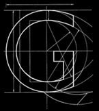
The letters here, the ones you are currently reading, don’t exist in any palpable form, they’re the result, as you no doubt know, of electricity exciting a liquid crystal. They’re virtual letters and only come into touch with reality when ink is spat through those tiny jets. There’s no feeling to them, the breath of humanity passes them by, as indeed does the sweat of the compositor swearing shittyfuckbollocks as he drops a case of type.

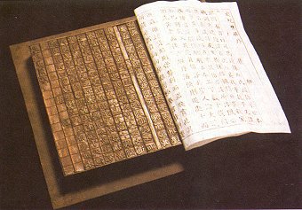
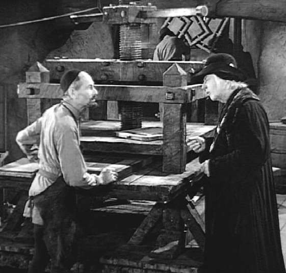
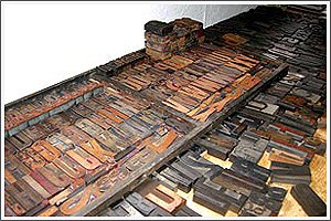
Letters for most printed things used to be made of lead, well yes, you’re right, they were made of wood before they were made of lead,


but they were lead for a long time and they had weight, they had substance. As anyone who has brandished a bossing stick:


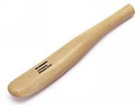
braying flashing over a bay window will know: lead’s a Nice Thing to Hold.

These lead letters were kept in type cases, which were wooden trays divided up into small compartments – now mainly seen on kitchen walls, usually containing things that should rightly be in the bin.


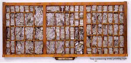
Of the two cases that contained the font of a particular typeface, the upper case had all the capitals, the lower case had all the small letters. The letters were all in individual compartments, in the upper case the compartments were mainly the same size, in the lower case the sizes varied with the popularity of the letter, the e compartment was the biggest.


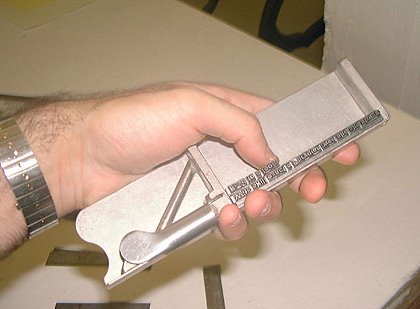
Individual letters would be plucked out of the case. There was a nick on one face and you had to feel for this with your thumb nail so you could set all the letters the right way up. Your left hand [or right if you were left handed] held the stick, with your left thumb holding the assembled type in place.


The stick was set to a line length and as the words got close to the end of the line you would fill the gap with blank em’s or en’s or tiny slivers of brass to make everything tight. If the copy was justified you would have to have to insert spaces between each word.

You could set two or three lines of type in the stick then you had to transfer them to the galley tray. It was a good trick to get the type out in one piece, and a nightmare if you didn’t.

When the lines were set and the section was complete you had to wind a bit of string round all the type to stop it falling All Over the Place. The knot to secure this was a tricky number, sort of slipped and tucked under the winding at a corner.


Enough for now, go away and practice the above until it becomes second nature and your hand reaches automatically to the correct compartment, faultlessly plucking letters out at a mind-bending speed.

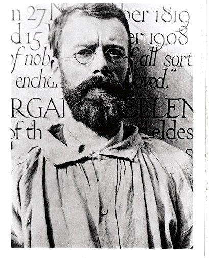
The Holmfirth Typographical Society would like to thank Matthew Kirschenbaum, Assistant Professor of English and Maryland Institute for Technology in the Humanities, University of Maryland for some of the pictures in this article. To see more images and a good description of the process just click here and you shall be sped across the internet to Amerikey.

Spot the faux pas

Typographical Type Kinda Agencies (loosely associated) past and present:

The Chase (a rectangular iron frame in which a form of composed type is secured and locked by quoins for printing.)

http://www.thechase.co.uk

Still going strong in the Madchester


Kerning Pairs (Definition: Kerning is the adjustment of space between pairs of letters to make them more visually appealing. Some type comes with kerning pairs, commonly kerned pairs of letters with the spacing already adjusted for best visual appearance.)

Long gone Leeds typesetters. Anyone know who went where?


Letterror - http://www.letterror.com

Erik van Blokland and Just van Rossum the Dutch nutters, still going strong by the looks of the things. I had the pleasure of meeting these 2 with Neville Brody back in the 90’s

Of Mouse Traps and Cartography

The minutes of the last meeting were read and agreed by the Chairman [honest].

It was found necessary to fine Mr Holroyd for tardiness and the incorrect use of the term font. This latter offence carrying the maximum sentence of possibly stripping him of his affiliation. The matter has been referred to committee.

For the unsuspecting amongst us, let us remind you: a FONT is a collection of type in one size and style. A TYPEFACE is a design of type , including a full range of characters: letters, numbers and marks of punctuation, in all sizes. We really need to get this sorted out.

It was resolved that in future we should meet in pubs that serve only beer – from one pump. Considering the only known pub to do this is in Kent, future meetings might be delayed.

Mr Holroyd has a problem with mice, possibly caused by his habit of feeding them Mars Bars and Kit Kats, we’re not sure. Suggestions were made for the entrapment of said rodents and the efficacy of the Tilting Toilet Roll Humane Mouse Collector [patent app. for] was discussed.


The main objection being: what if the roll rolled sideways with the mouse inside would it not then miss the bucket? Mr Holroyd was fined again.

Mr Jones suggested we collect rice on a chess board, much in the manner of Persian Kings, putting a single grain on the first square and two on the second and four on the third, doubling it every time, and he spent a happy couple of minutes doubling figures until he lost the will to live on square 13.

Well further [exhaustive] research shows us that by square 64 there are 9,223,372,036,854,780,000 grains of rice, but the total, cumulative, amount of rice grains on the board is: 18,446,744,073,709,551,615 which is clearly more than required for a byriani I think you'll agree. To put this in perspective it's been estimated [by Clever People at the University of Hawaii, where you can do a degree in Pure Maths and Surfing] that there are 663,000,000,000,000,000,000,000 grains of sand in the world [where a grain of sand is specifically rock detritus with a particle diameter of 0.06-2 mm. according to standard sedimentological classification]. 43,252,003,274,489,856,00 is the number of possible combinations of Rubik's Cube, and the inventor of Mr Potato Head was one George Lerner of New York, in 1952.

Mr Coombes pointed out that you only need four colours to colour in a map no matter how complicated the borders are. Then talk turned to Samurai swords and we got confused and Mr Holroyd had to be fined again.

Before you knew it Mr Jones had his holiday health insurance policy out on the table and was trying to fold it more than seven times - there’s no stopping some folk.

Which brings us to rotoscoping.


Complaints were received that some junior members of certain affiliated associations were questioning the nomenclature of particular filmmaking techniques, especially that used in the forthcoming film A Scanner Darkly [an adaptation of a Philip K Dick story]. The Animation Committee was consulted and it was confirmed that the process of animating movements by directly tracing from live-action footage was indeed called rotoscoping.

Before the meeting came to a close Mr Jones entertained us with an amusing anecdote describing the art of making dogs defecate on demand. Apparently the insertion of a matchstick in the dogs derrière instantly produces the desired effect. Caution was advocated and the longer kitchen match was considered preferable to a Swan Vesta. Mr Holroyd graphically demonstrated the process on a larger scale with an oar and an elephant and had to be fined again.

Thursday

Where it all started

NINE LONG NARROW BOATS, FOUR SHORT Do.

Meeting

There's a meeting tonight.
7:30 Farmers Arms, Parkhead, Holmfirth - where else?
Whether you're a Tunnel Man or a Typographer
Be there or forever be in the dark.

Tuesday

Before we go any further...

...a glossary is perhaps necessary.

Uncial – written in or pertaining to a form of majuscule writing having no lower case letters and more curves than capitals, used chiefly in the 3rd to 9th century, as you'll no doubt remember.

Majuscule – capital letters

Minuscule – a small cursive script developed in the 7th century from the uncial form

Cursive – flowing strokes resembling handwriting, joined up writing.

Upper case – majuscule letters

Lower case – minuscule letters

Capital letters – in the upper case

Case – a wooden tray with partitions containing type, usually in pairs one set above the other. The upper case contains the capital letters and the lower case contains the small letters and auxiliary type.

Font – a collection of type in one size and style

Typeface – a design of type , including a full range of characters, as letters, numbers and marks of punctuation, in all sizes.

Furniture – see Dead Metal

Dead metal – pieces of wood or metal less than type high which are formed in amongst type to space it out to fit in a chase.

Chase – a rectangular iron frame in which a form of composed type is secured and locked by quoins for printing.

Quoin – a wedge of wood or metal, more recently an adjustable metal wedge, for securing type in a chase.

Bed – to lock up forms and chases in a press prior to printing

Form – an assemblage of type, leads and furniture secured in a chase.

Leading – a thin strip of type metal or brass, less than type height, used to increase space between lines of composed type ready for printing.

Kern – an element of a letter projecting beyond the body of the type, especially with certain italic letters.

Ligature – two characters made as one piece of type, often with kerned pairs: fi ff, not to be confused with diphthong: AE OE

Composing Stick – a portable, adjustable metal tray held by the compositor in one hand as they place in it type gathered from the case by the other hand

Serif – the small horizontal line finishing off the main stroke of a letter. Derived from Roman letters cut in stone where the letter-cutter’s chisel would begin and end the stroke. Believed to be derived from the Dutch schreef stroke.

Sans Serif – letters without serifs

Grotesque - see Sans Serif

Em – a measure, originally the width of a capital M

En – a measure, half the width or an em.

Point – a unit of measure, there are 72 points to an inch.

Point size – originally the distance from the top of the highest ascender to the bottom of the lowest descender in points, now more commonly the height of a capital letter in millimetres.

Monday

A brief history of Holes in the Ground.

Man has always scratched the ground, fascinated by his origins, driven by an urge for food, an unhealthy desire for untold wealth, or intent on shifting large quantities of the planet with a view to getting about more easily.

“Work is of two kinds: first, altering the position of matter at or near the earth’s surface, relative to other such matter; second, telling other people to do so. The first is unpleasant and ill paid, the second is pleasant and highly paid”
Bertrand Russell.

It was 1880, in Bucyrus, Ohio, that Daniel P Eells, with his friends and family, formed the Bucyrus Foundry and Manufacturing Company. In 1882 the first Bucyrus Excavating Steam Shovel left the Foundry for the Northern Pacific Railroad Company. [See: Once Upon a Time in the West, director Sergio Leone]


In 1930 Bucyrus-Erie [as it was then known, after a breathtaking merger with the Erie Steam Shovel Company] merged with Ruston & Hornsby of the UK to form Ruston Bucyrus.


Specification of the Lorenz L8600 Earthmover:
Capacity, Heaped: 8 cubic yards
Width of Cut: 84"
Overall Width: 8' 6"
Depth of Cut: 8"
Depth of Spread: 0" to 14.5"
Ground Clearance: 12"
Overall Raised Height: 6' 5"
Push-Off Cylinder: 4" x 36"
Front Gate Cylinders: 3" x 10"
Tank Lift Cylinders: 3.5" x 16"
Sequential Front Gate and Push-Off: Standard
Rear Tires & Tubes: 14.9" x 24" 6 Ply, 12 Ply Optional
Front Tires & Tubes: 15" x 22.5" 12 Ply
Weight: 7000 lbs.
Tongue Jack: Standard
Heavy-Duty Reversible Cutting Edges: Standard
Replaceable Side Bits: Standard
Hydraulic Spool Required: Dual Spool, Dual acting
Horse Power Required: 150-225 HP
Hydraulic Supply Hoses & Tips: Standard

remember: DON’T MESS WITH TUNNELLING MEN


Next week: Aveling Barford, steam rollers and the desire for flatness

Sunday

The History of Typography part 1

How it used to be done…

Printing, as anyone who had a John Bull Printing Outfit will know,


used to be about putting ink on letter-shaped bits of metal or wood then transferring the ink to the paper. This was the case from 1448 [Gutenberg] to 1971 when the dot matrix printer came upon us. Oh yes there was etching and gravure and silk-screen printing, and Xerox must needs be mentioned. But for general, work-a-day printing, from your typewriter to the penguin novel, ink was smeared on letter-shaped metal and then stamped on paper. [okay so your typewriter used a ribbon, but let’s not get picky]. Today printing is all dots and digital and photosensitive. Hot metal has gone the way of all things.

It all started in China, in about 1045, Pi Sheng, with nothing to do one rainy afternoon, the television have not been invented and his home team playing away, began fiddling around with movable type,


then a mere 400 years later Johannes Gensfleisch zur Laden zum Gutenberg, by all accounts a blacksmith [and there’s nothing wrong with that] brought the whole thing together with a printing press in 1455,


a strenuous business befitting an ironmonger I feel.

Our very own William Caxton introduced us to printing in 1474,


though many were puzzled by this new high technology.

Thursday

Underground Auction


Members of the Holmfirth Typographical Society and Tunnelling Equipment Sales Team examining Lot 406: WAGONS, various &Do. under the watchful eye of chief auctioneer Vernon Dixon.

Wednesday

The stuff of tunnel men

Air Scrubber
Annular space
Anti-roll Jack
Anti-rotation fin
Articulated cutterhead
Back grouting
Block catcher
Bob Point Bit
Boomhead shield
Buck Gear
Cake
Centrifugal separator
Clamping jack
Clogging
Coarse vibrating shield
Cutterhead support articulation
Digging bucket
Earth pressure balanced shield
Emergency Tail Seal
Exhaust dust cleaner
Filter band press
Finger shape shield tail
Foaming solution
Fullface cutterhead
Gathering arms
Gathering apron
Gripper carrier
Gripper shoes
Hinged scrapper wing
Hydraulic Slurry Mucking
Mucking bucket
Mucking scoop
Peripherical buckets
Ram pads
Regripping
Roadheader shield
Tailskin articulation
Thrust cylinders

Monday

Early days

Some would say this is where it all started in the lettering Industry:


The Phoenician alphabet.

Phoenicians lived in the Mediterranean and so were also responsible for the Package Holiday. They were famous for having Phoenician Gallerys, huge ships with oars that carried great Works of Art about and often sank so that people could discover them later.

Known as the Purple People because of the much sought after purple dye they made in their city of Tyre [which they didn't invent - that was Charles Goodyear]. The greek for purple was phoinix which is why they became Phoenician, until Romans found them and called then Punic because their word for purple was puniceus. Which then led to the Punic Wars.

The Punic Wars were because the Romans wanted to holiday in Sicily and this belonged to the Cathaginians who were also Phoenician on account of their colourful language [see above]. In the First Punic War the Romans got their towels on the deckchairs after a Bloody Battle and subsequently enjoyed holidays in Sicily for thirty years until The Second Punic War which was famous because it was in the Second Punic War that Hannibal famously crossed the Alps with his Elephants. Hannibal won many battles because: 1, no one had ever seen an elephant before and: 2. everyone was off fighting in Sicily. But despite Hannibal's, somewhat misguided, victories, the Romans held onto Sicily and the Carthaginians had to be content with holidays in Crete.

Tuesday

Improvements in tunnel perimeter management

Casagrande's new tunnel support equipment helps stabilize weak soils and broken rock by constructing an arch around the tunnel's periphery, ahead of the face, reducing the need for expensive temporary support systems.


The PG 125 in action

Mind you Thunderbirds never had this problem...

Great letter-cutters of our time.

Eric Gill


Undoubtedly a Top Man in the world of typography, and a main player in religious art of the Catholic doctrine. But let's not forget his dubious appetite for those who tend not to shave in the morning.


And he wasn't worried what relation they were to him either. But he gave us Gill and Gill sans and Perpetua, which have a purity of line and deed in direct contradiction to his where he put his priapus.


So where do we go from here?
Is our behaviour any relation to our talent?
No, clearly not.
But is it easier to forgive the talented pervert
than the mediocre oddball?

I'll leave you with a poem:

Can you forgive the fastidious cannibal
His unusual pleasures? Does your charity
Embrace the noisy whore, forgetting her manners
In front of your daughter? The cocky-walker
Who teaches your wife to care about clothes again
And look in the mirror? And yet defend
Your wife from your enemy and your daughter
From the convincing whore, your life from the cannibal?
When you can do this, and this, and lose
Your wife, your life and always your curious daughter
Then we may talk of love and what we mean.

PJ Kavanagh

Monday

GOINGS


David Lance Goings

Two floors up the Ramsden Street building, we used to run the stairs two at a time, so that, on arrival, in our calligraphy class, our hands would be shaking for ten minutes and we could delay the black ink business...

Friday

illumination


photographs kindly supplied by our chairman
[using his phone ffs]

High definition images will be forthcoming, if the Hon, Sec. can get off his arse this forenoon

First Post

During a regular meeting of The Education of Simon Jones, the Holmfirth Typographical Society and Tunnelling Company was formed, with a view to celebrating the rules and happenstance settings of the print medium and selling off excess tunnelling equipment for profit.